case study
〰️
case study 〰️
A community collaboration focused on connection, inclusion, and trust.
about
The Lamoille Equity Team (LET) needed a professional, welcoming website to serve as a central hub for equity work in Lamoille County Vermont. The project included a full website redesign, a refreshed logo inspired by local symbolism, and a polished presentation for the Executive Board. The goal was to create a digital space that fosters connection, builds trust, and invites the community to engage.
LET required a clean, accessible website that preserved its existing mission-driven messaging while improving structure and usability. The primary audience includes local residents, nonprofits, municipalities, donors, and businesses. The design needed to feel warm, playful, and community-oriented while remaining professional and not overstimulating. Core calls to action were “Join Us” and “Donate,” with a clear pathway from homepage to event registration.
challenges
The main challenge was transforming a loosely structured existing site into a cohesive, intuitive hub while meeting a firm mid-December deadline. The design needed to balance warmth and professionalism without relying on animation or visual clutter. Additionally, multiple stakeholders and weekly review cycles required efficient communication and tightly managed milestones.
logo variations
design solutions
Logo Design:
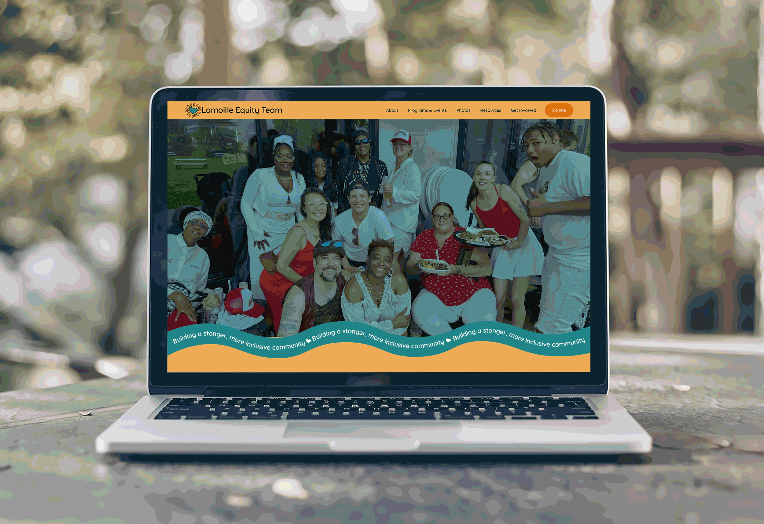
The refreshed logo incorporates the Lamoille River, a bridge symbolizing connection, and trees to reflect place and community. Warm yellow and teal tones reinforce feelings of optimism and trust, while subtle heart-inspired shapes emphasize love and inclusion.
The final logo utilizes a graphic representation of a beloved bridge in the community to ground the organization in specific place and was designed to be versatile across digital platforms, presentations, and printed materials.
Website Design:
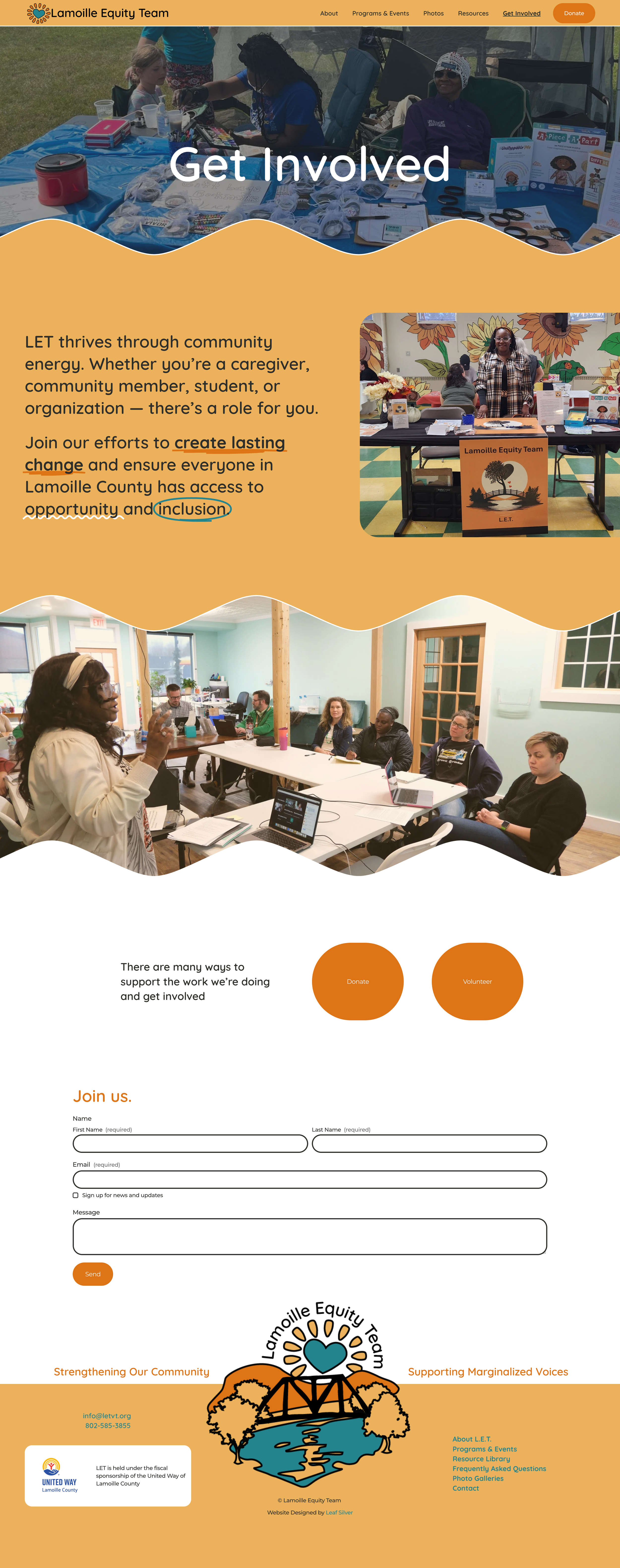
The website was restructured into five core pages—Home, About, Programs & Events, Resources, and Get Involved—to support a clear and intuitive visitor journey. The design emphasizes warm photography, organic graphics like leaves and roots, clean typography, and strong calls to action. Built on Squarespace, the site integrates event registration, downloadable resources, newsletter sign-up, and donation pathways while maintaining a calm, uncluttered visual experience.
final product
The final website delivers a cohesive, inviting digital presence that clearly communicates LET’s mission and makes engagement simple. It includes event registration pathways, downloadable resources, newsletter sign-up, and donation opportunities—all supported by a meaningful and adaptable brand identity.
This project elevated LET’s online presence into a structured, community-centered platform that reflects its values of connection, inclusion, and trust. The result is a polished, board-ready website and brand identity that strengthens visibility, encourages participation, and positions LET as a trusted equity leader in Lamoille County.
explore more projects…